
WRING
A thoughtfully crafted haircare brand
WRING is a personal branding project aimed at developing a haircare brand tailored specifically for curly hair. The objective was clear: to create a comprehensive brand identity from logo design to product packaging, reflecting the vibrancy and uniqueness of curly hair while prioritising accessibility and inclusivity.

Process
At the start of the WRING project, I delved into exploration and ideation, capturing my thoughts and inspirations in a word map. Among the myriad of concepts, three words stood out—Pop, Bon, and Wring. These words provided a starting point, guiding me towards the direction I wanted to take. "Pop" signifies the vivacity of curls, “Bon" not only signifies “good hair” but is also derived from the word "bonnet," the essential sleepwear for curly hair care, and "Wring" embodies the twisted motion of wringing, reflecting the brand's dynamic energy and essence. I ultimately picked “Wring” as I felt this had more design possibilities.
Logo Development
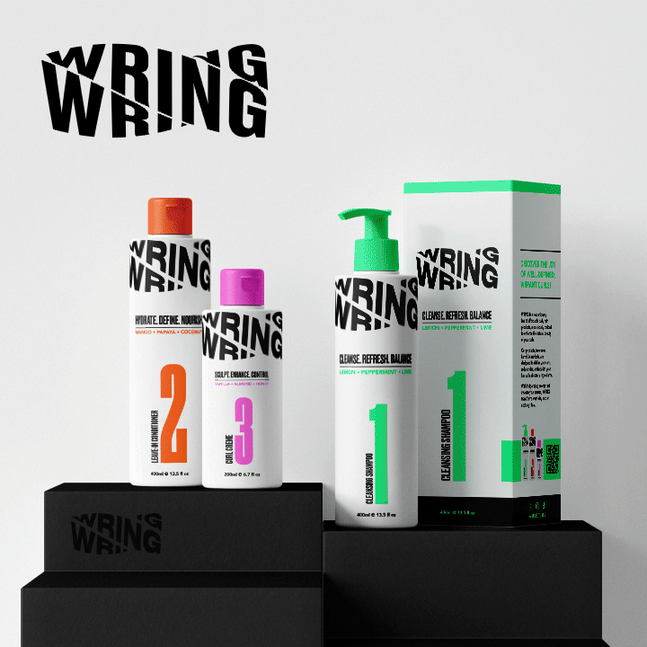
From initial sketches to refined concepts, I explored various directions to encapsulate the brand's identity. Ultimately, I settled on a bold, all-caps logo of the word "WRING," infused with an animated twist to emulate the motion of wringing.
The logo, set in the typeface Druk Bold, became an animated focal point, constantly in motion, a nod to the brand's name and concept and a reflection of the dynamism of curly hair.

Brand Values, Language and Colour Palette
The language used in the WRING project reflects the brand's core values of innovation, celebration, and accessibility. With an emphasis on being new, exciting, and all-natural, WRING's language aims to connect with its target audience by offering affordable products that enhance the natural beauty of curly hair.
The choice of words in the brand statement confidently highlights the brand's commitment to providing high-quality, chemical-free products that should be exciting for all.
To emphasize this, I chose to go with bright and bold colours to reflect the brand's energy and vibrancy, inviting users to embrace their curls with confidence.

Product Development
Product development for WRING went beyond creating haircare products to encompass designing packaging for shampoo, conditioner, and styling products. Additionally, I crafted mockups of WRING branded hair tools, further enhancing the brand's identity across all touchpoints.
Each product was assigned descriptors that encapsulated its essence and benefits, such as "CLEANSE. REFRESH. BALANCE." and "HYDRATE. DEFINE. NOURISH." reflecting WRING's vibrant and empowering brand identity. Moreover, the choice of scents for each product complemented the colours of the packaging, adding an extra layer of sensory delight for users.
These decisions were made to create a holistic and immersive brand experience that celebrated the beauty of curly hair while providing effective and enjoyable haircare solutions.
Mockup App and Instagram Page
In my quest to create an immersive brand experience, I created a mockup app embodying the ethos of WRING. The app integrates innovative features, including a loyalty programme for user-generated content, fostering brand engagement and community participation. Through thoughtful design thinking, I aimed to empower users while reinforcing the brand's commitment to accessible and inclusive haircare solutions.
I extended the brand's reach by creating a mockup Instagram page. With a focus on striking visuals and a fun, inclusive tone, the page aimed to build an engaged community around the WRING brand. The mockup Instagram page served as a platform to showcase the vibrancy of curly hair while fostering connection and conversation among users. The page was designed to reflect the brand's ethos and values, inviting users to join the WRING community and celebrate their curls with confidence.


Figma Prototype of the Website
The project culminated with the conceptualisation of WRING's digital presence. Using Figma, I created a prototype homepage, aiming to reflect the brand's essence through captivating visuals.
Every element was carefully considered to engage the audience and immerse them in the vibrant world of WRING. It was imperative to ensure that the homepage reflected the diversity of the target audience, transcending gender and race boundaries. Just as in the video banner, the homepage featured a diverse array of images representing individuals from various racial and gender backgrounds. This deliberate inclusion aimed to create a welcoming and inclusive space for all users to feel empowered and represented.